Case Study
Revamping the Loan Payment Schedule
The Big Picture
Our UX team spent the majority of 2020 working on a massive overhaul of the customer account experience for one of our company’s consumer lending brands. Updating the entirety of the customer account had been kicking around the general to-do list for years due to the sheer scale of the project. This inevitably led to page-by-page upkeep as needed for functionality or legal changes.
The result: a confusing, disjointed, and frustrating customer experience.
The Challenge
The payment schedule page was our first priority based on a number of known and hypothesized issues:
Known:
The page did not show actual payments, only the amortized schedule
Payment statuses not available
Customer support center was routinely bogged down with large call volume about accessing payment schedules
Hypothesized:
Confusing page title: Initial Amortization Schedule
Difficult to navigate to:
Could only be reached by a small “View Payment Schedule” text link from the dashboard
Was a misleading title since the page was not called Payment Schedule, nor did it show their actual payments
Our Process
Team responsibilities I contributed to:
1. Researching payment schedule layouts from competitors and looking at how major banks (e.g. Chase) format credit card schedules
2. Figuring out what information customers wanted and then finding the best way to display that info
3. Collaborating with PMs on what payment information we could pull to display
a. This was key to figure out at the beginning — no sense in adding fields to only later on find out that we don’t have that functionality
My individual responsibilities:
1. Researching commonly-used payment schedule language
2. Replacing strictly financial terms used for the page title, category titles and tool tips to more self-explanatory language
3. Collaborating with PMs to see if the financial terms being used here were being used consistently across the account home experience and in any customer support scripting
4. Working with our legal and compliance team to avoid potential legal language issues
The PM sent us a rough draft of the information we could pull, and the UI designer threw together a quick mockup showing all of the fields.
The UX researcher and UI designer began discussions on the layout and styling, and I worked on the page title and the category headers. My two main concerns were simplification and space.
“Transaction History & Future Scheduled Payments” didn’t exactly roll off the tongue, and when looking at it on our smallest device size, it took up the entire top half of the screen. But the PM made a good point that by including the disbursement amount and potential additional (and missed or failed) payments, this wasn’t strictly a set payment schedule.
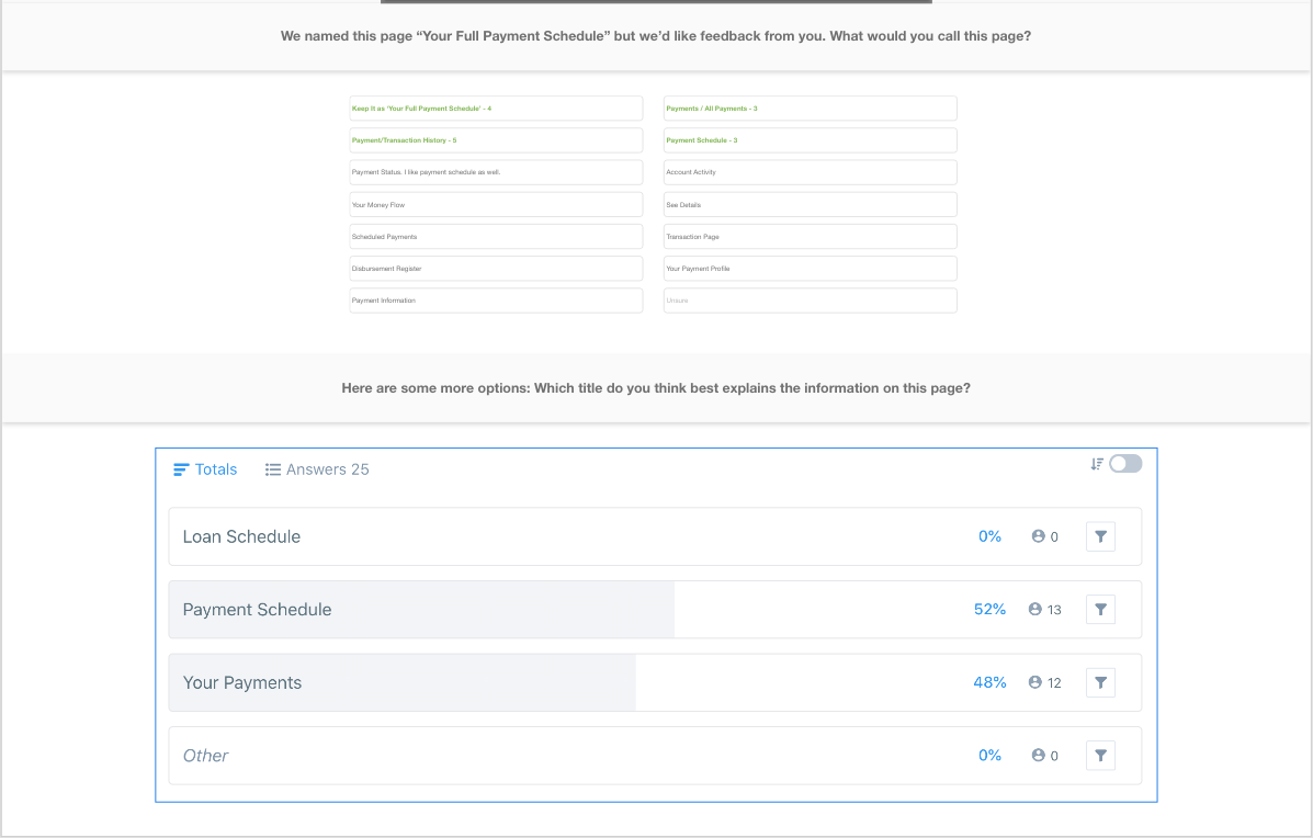
I brainstormed a bunch of alternate titles, whittled down to the top contenders, and then ran those by my team and the PM to get their thoughts. I settled on “Your Full Payment Schedule” as the optimal choice. I wanted to make sure “Payment Schedule” was still in the title, since this is what customers were explicitly looking for. The added “Full” was meant to imply the additional activity.
We did some quick user testing to confirm I was on the right track.
Version 2
For the category titles, I shortened the lengthy “Applied to Principal,” “Applied to Interest,” and “Applied to Fees,” to the more direct and shorter “Principal Paid,” “Interest Paid,” and “Fees Paid.”
Version 2 — Expanded
The “Applied to X” title was a bit formal sounding and posed significant spacing problems for mobile. We knew the majority of customers would be viewing this on their phones, so even a one-character difference was huge.
Adjusting Information Hierarchy
Because of space constraints, we needed to make sure we were displaying the most important information up front. There was no way we could display everything like we would on the desktop version. We hypothesized that Transaction Amount and Payment type would be the top two (based on customer support calls). For the rest, we relied on user testing.
We had a clear winning field order for the desktop view where we could display everything.
Transaction amount —> Payment type —> Payment status —> Fees paid —> Principal Balance
For mobile, we switched tactics and used a ranking question to see what info customers were really depending on.
Transaction amount —> Payment (transaction) type —> Payment Status —> Remaining Loan Balance
This helped us better organize the layout on mobile by arranging the two-most important fields above the final two fields. The dividing line helped emphasize the Transaction amount and Transaction type.
Final Product
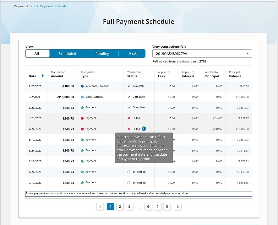
After three more rounds of iterations with our stakeholders and the legal and compliance team, we (finally) had our finished product.
Finalized Changes
Replaced (almost) all title case styling with sentence case.
Increased scan-ability
Decreased cognitive load
Friendlier, less imposing
Changed “Payments for Loan” to “View transactions for” to be inclusive of all types of account activity.
Added tool tip for Failed payments to explain why the amount may differ from their regularly scheduled amount.
Wasn’t keen on this final version, since it didn’t pass the readability or comprehension check in my opinion
Legal team’s final decree, so could not tweak any further
Added full table disclaimer about potential payment changes per legal’s request.
Didn't have too much leeway with the wording, but was satisfied that it got the basic “these numbers may change depending on your payments” message across


